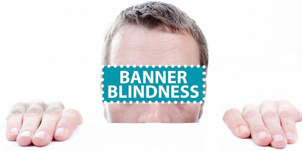
Display ads are difficult to do well and now we’re lucky if they’re seen at all. Ad blocking is standard for Apple IOS and most smartphones but there is another problem that marketers need to be aware of called “Banner Blindness.”
Banner Blindness
“According to Wikipedia, Banner Blindness is a phenomenon in web usability where visitors to a website consciously or subconsciously ignore banner-like information, which can also be called ad blindness or banner noise.”
User experience was so full of terrible pop-ups and ads in the early days of the internet that we started ignoring anything that looks like advertising. Remember when you had to click out of 5 pop up ads in order to visit a web page? We’ve come a long way but our brains are trying to conserve energy and are resistant to marketing messages. Facebook users have even started ignoring advertising in the newsfeed. Look at this eyetracking heat map example from Neilsen Norman Group:
 These examples show (from left to right): scanning, partial reading, and thorough reading.
So what can we do to combat Banner Blindness?
- Make your ads look more like the page (not paid native ads, that may be misleading).
- Retarget known users.
- Show users products that interest them.
- Be clear what you’re advertising and give users an enticing offer.
What to avoid:
- Don’t pop up new windows.
- Avoid using buttons that look like they’re from the operating system.
- Again, don’t do native advertising. It has to be obvious that it’s an ad.
- Elements that ruin user experience like music, flashing or following the mouse.
In conclusion, avoid taking shortcuts when it comes to banner ads. It can cheapen your brand and annoy users and hurt your customer loyalty. Your best bet is creating targeted ads that are delivered across different channels which is now easier than ever.





Leave A Comment